In my last post I created a side column to display a table of contents, which appears as pinned on the right side when browse on big monitors and will layout as a stack on mobile devices, I was satisfied.
Problem
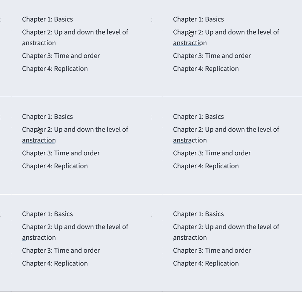
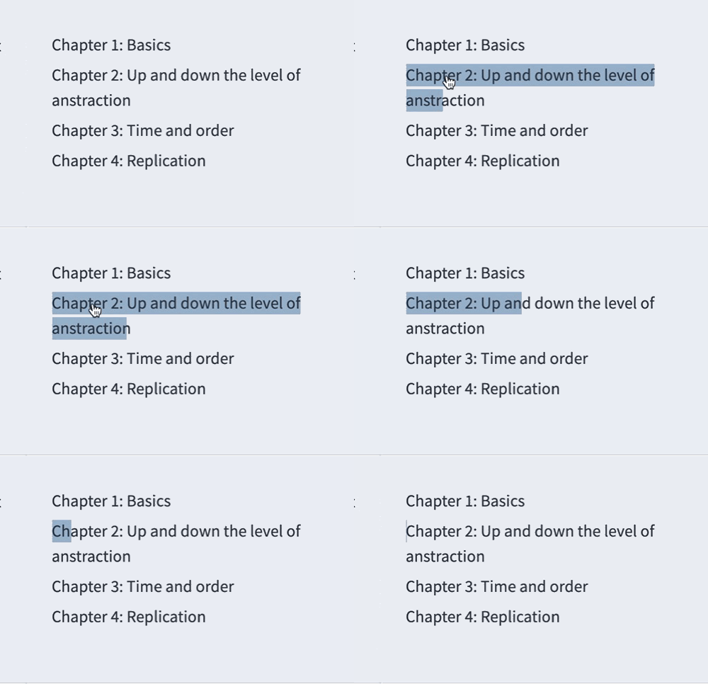
Today I noticed that this new layout breaks my link animation. Annoyingly, becase I restricted the table of contents size, causing a long link to wrap across many lines but the animation only shows at the last line:

Why?
Now I've learned a bit CSS so I took a look at the part that I referenced from somewhere online:
  &:after {
    // line styles
    border-radius: 0.2em;
    border-top: 0.15em solid $link-anime-color;
    bottom: 0.1em;

    // line position
    position: absolute;
    right: 100%;
    left: 0;

    // no content, of course, no need
    content: "";

    // how do changed attributes apply
    transition: right 5s cubic-bezier(0,.5,0,1);
  }

  &:hover:after {
    right: 0;
  }
In a short: &:after appends contents to applied elements, in my case, it appends a line.
right and left defines positions of the left and right points of the line. Therefore the line's left part is at the row's leftside (0% to left side), but at the same time, right part is also at the left side of the row(100% to right side), making it "invisible". Think about this, what does left: 50%; right: 50%; mean (I will explain next)?
Then &:hover:after defines what to append after a hovered link. Since now the right becomes "0", meaning it will expand to the rightmost side of the row. Given the transition defined above, it will expand in exactly 5 seconds, following the cubic-bezier function defined manner.
With above said, what does left: 50%; right: 50% present? Well, it presents an "invisible" line in the middle, then if you change the transition for left and hover behaivor to following:
  transition: right 5s cubic-bezier(0,.5,0,1), left 5s cubic-bezier(0,.5,0,1);

  &:hover:after {
    left: 0;
    right: 0;
  }
It will expand from center to both sides! The expanding behavior is determined by the transition, in this case they are at the same speed and manner.

Still, it doesn't solve my problem, but hope with this example you get the idea.
::after is NOT What I Need
This animation actually works fine for short links that occupies only one line. It could work for multiple lines but I guess the solution will be very complex, with calculation involved to determine the right start point and expanding length, which I also don't have enough knowledge and understanding to implement. Also to be honest I don't like this way of "appending" things. It feels redundant and I want something that defines the link itself.
I spent some time wandering on CSS styling and annimation documents. What I understood deeper is that link can have background-image and use background-size and background-position to determine the size and position. In my case it will be a line and with this background prefixed attribute, the image covers all the text of the link, so at least I don't need to calculate the length, and once the position is determined, I don't need to worry about it either.
Therefore, the only thing I need to change is the size. The new snippet is as following:
.ClassFoo {
  a {
    --lineHeight: 1.4em;
    --lineColor: #{$link-anime-color}; // Have to interpret as a string value first
    color: var(--color-link-primary);
    transition: all 5s cubic-bezier(0,.5,0,1);
    display: inline;
    text-decoration: none;
    padding-bottom: 0.1em;
    background: linear-gradient(to right, var(--lineColor), var(--lineColor));
    background-size: 0px var(--lineHeight);
    background-repeat: no-repeat;
    background-position: left 85%;

    &:hover{
      background-size: 100% var(--lineHeight);
    }
  }
}
The idea is simple as explained above: make the background a line and expand to 100% when hover on it.
I also learned how to use a variable with double hyphen and transition: all to include all potential attributes I want to change. Also I made it higher to appear like a "progress bar", indicating my theme - "a process".
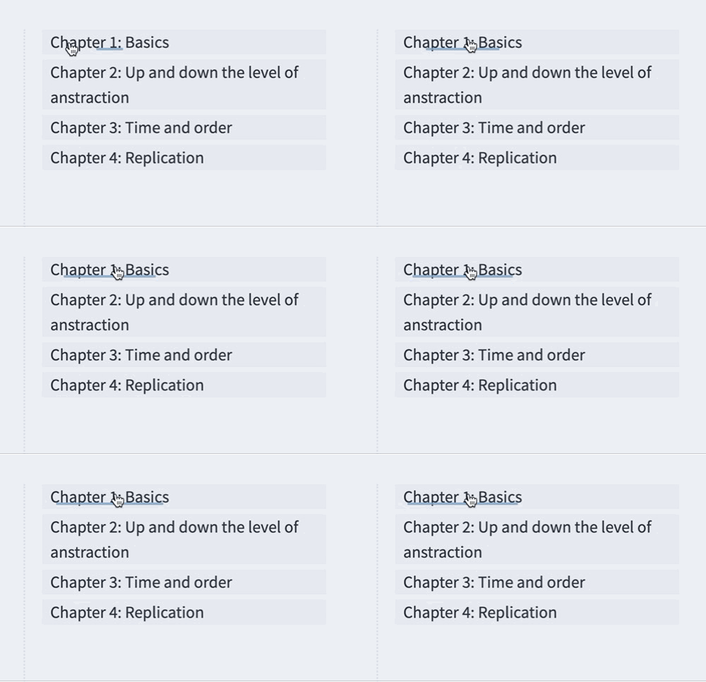
Now it looks like this:

Conclusion
I love it.